
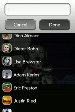
Yesterday we released Facebook for webOS 1.2.5 Beta which brings many improvements to our photo functionality including tagging support. Now that the release is out the door, I’d like to take some time to discuss the cooler aspects of the implementation particularly the Add Tag UI.
Design
The core layout of the Add Tag UI is an overlay container containing a fixed position header and a scrolling list below that. The entire screen is covered by these two elements, with the header section maintain its height and the content section expanding to cover the remainder.
This fixed header layout is fairly common throughout the app, the most common example being the navbar used in the majority of the application’s scenes, and is fairly easy to solve if the header is a fixed height and the content scrolls under the header. All that needs to be done is to position the header control using position: fixed and apply a margin-top to the list such that the first element in the list appears at the bottom of the fixed element.
I’ve never really like this solution as it requires that the header height be fixed and the list section be “aware” of the header rather than being only concerned about it’s own layout. With this in mind (and also wanting to play around with some of the cool things that WebKit offers but I have not been able to use on projects due to the IE factor), I decided to try out the flexible box layout type in webOS.
Flexible Box Layout
To provide some background, one of the key goals of the flexible box layout module is the ability to specify the size and growth of an element relative to both it’s siblings and it’s parent. While this was previously possible by using percentage layouts, each of the elements had to be aware of the size that their siblings expected and all elements needed to use the same relative system.
This is not the case with this layout scheme. Rather than defining a percentage of the container size, elements are defined with an affinity for the excess space in the container. This means that the layout first attempts to fit everything as it would normally layout, then adjusts each element based on the difference in size between the children and the parent. In practice this can generate much more stable, but still fluid layouts when creating applications in HTML+CSS.
The box-flex (-moz-box-flex, -webkit-box-flex) is used to define the resize affinity.
Values here can range from zero to any positive decimal value. When the value is zero, the element will not change size based on extra or lack of space in its parent. When this value is larger than zero the element is considered flexible. This means that when the layout engine determines that the parent box is either overflowed or underflowed these elements will expand or shrink such that all of the children fill the container. The differences in magnitudes of this value determines how the flexible elements are resized.
As an example a vertically oriented flexible box with 3 children whose flex values are 0, 1, and 2 and has 60px of open space will add 20px to the second element, 40px to the third element and leave the height of the first unchanged. On the other end of the spectrum if there is an overflow of 60px, the elements will be shrunk by the same dimensions above.
The flexible box model is supported by Safari 3+, Chrome 3+, Firefox 3+, and of course webOS. As covering the entirety of the specification was out of the scope of this post I would recommend reading some of the other excellent sources on this topic as well as the specification itself.
Implementation
For the Add Tag UI, we take advantage of the flexible overflow case outlined above. This allows the upper section to layout at it’s natural size using -webkit-box-flex: 0 and the user list section to expand to fill the remainder of the page using -webkit-box-flex: 1. By defining the list section to be a Scroller with an embedded List, we can maintain fixed behavior for the upper section and still allow for an arbitrary number of users.
Implemented this looks something like the following:</p>
<div class="tag-selector">
  <div class="tag-selector-panel">
    <div x-mojo-element="TextField"></div>
    <div class="form-wrapper">
      <div x-mojo-element="Button"></div>
      <div x-mojo-element="Button"></div>
    </div>
  </div>
  <div class="tag-scroller" x-mojo-element="Scroller">
    <div x-mojo-element="List"></div>
  </div>
</div>
With the CSS doing most of the heavy lifting:
.tag-selector {
  position: absolute;
  top: 0;
  left: 0;
  bottom: 0;
  right: 0;

  z-index: 1000;

  display: -webkit-box;
  -webkit-box-orient: vertical;
}

.tag-scroller {
  position: static !important;
  -webkit-box-flex: 1;
}
A live demo for Firefox and Safari/Chrome available is available here. Note that the demo is running a modified version to handle desktop and cross-browser differences. These are mostly experimental prefix concerns i.e. display: -webkit-box becomes
    display: -webkit-box;
    display: -moz-box;
    display: box;
Although there are a few hacks in place to force common layout under both WebKit and Gecko (See Bug 570036). Such is life developing with CSS3 :)
Future Posts
As a final note, I’d like to start a series of these posts. Are there any sections of the Facebook app that you would like me to provide an overview of their implementation? Feel free to comment on this post or drop me a line at kpdecker@gmail.com.